

How to plan your story structure with Excel
- Anithra W

- May 17, 2020
- 5 min read
Updated: May 17, 2020
Excel is a fabulous way to plan, analyse and fix your story structure. Don't be nervous about graphs, charts and outlines because they are incredibly useful tools to view your story in a new light. Sometimes, a change of perspective really does wonders and Excel is especially invaluable when you're wrangling multiple POVs.
Organise your story structure
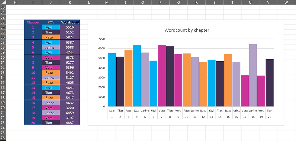
Take a look below at this simple chart I created for one of my novels.


It is organised by:
Chapter
Character POV
Word count
Chapter event
Timeline
I find it very useful to colour-code each POV character in a specific colour, making it easier to identify their chapters or analyse the distribution of chapters for each POV. With the word count next to it, you can easily update chapter lengths or switch the order of chapters.
A great advantage of Excel is flexibility. Each chapter is summed up with a defining event to remind me what happened. If you want, you can take this even further and include a summary of each scene. This is also a good exercise to weed out filler or inconsequential scenes.
At the end, I've included a timeline--a probably under-used but crucial element to keeping track of time in your story world. This story spanned 60 days from beginning to end, and the timeline helped me calculate what day it would be when switching between POV characters who had been travelling.
Visualise your story
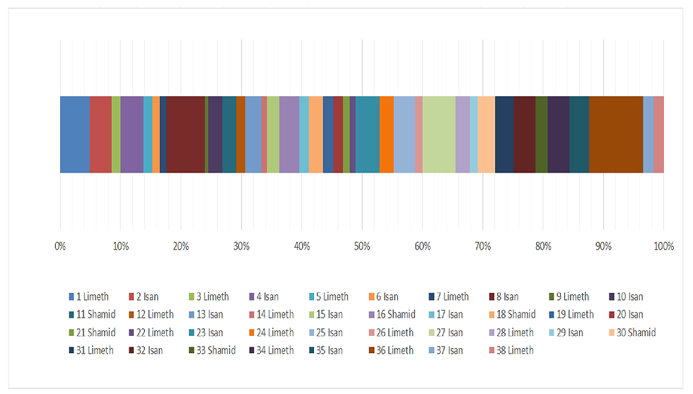
While word counts in a table are handy, they're simply not as...visual as a chart like this one below.
Do you notice the difference? At a glance, you can instantly assess the length of each chapter from the start of your novel to the end.
I can see that chapter 23 is halfway through the novel, that second quarter of the novel has many short chapters, and that chapter 36 is the largest.
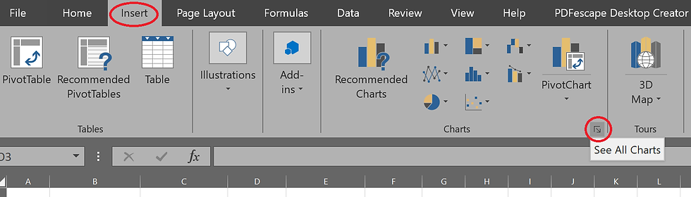
To create a chart like this:
Select all three of your Chapter, Character POV and Wordcount data
Click the 'Insert' tab and open 'See all charts'
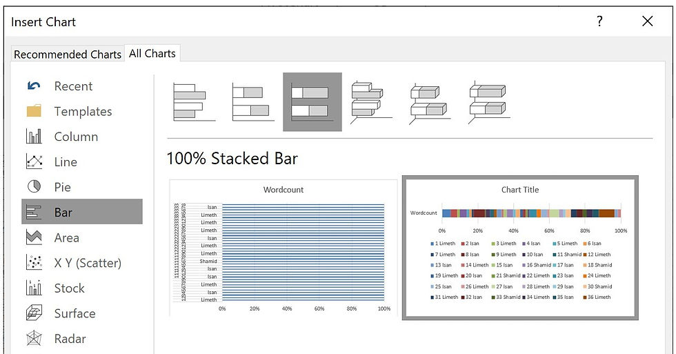
Navigate to the tab named 'All Charts'
Select 'Bar' from the left-hand menu
Choose the '100% Stacked Bar' format
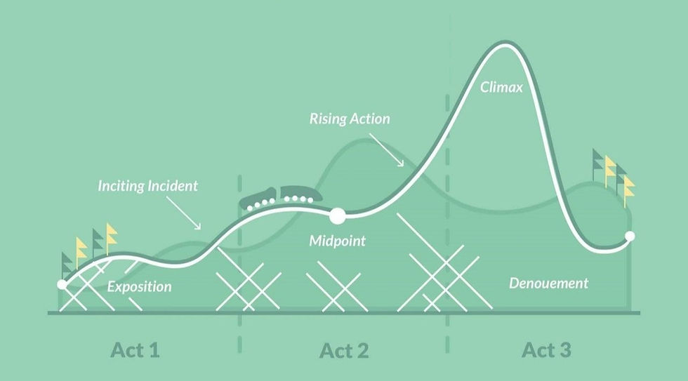
Decide your plot structure
The image below is a representation of the six-stage plot structure by Michael Hauge, which I discussed in my post ' Why is story structure important? ' so take a look at that post if you want to learn more about it.
What we're going to do now is use this exact structure on top of our own story chart.


We will create this overlay using the earlier technique. This time, create a 100% stacked chart by using the highlighted data I've shown on the left.
If you use the 0% to 100% values, your chart won't be correct. You need to use the cumulative values, which I have calculated from 0 - 1. I've factored in the 90-99% range for the climax. Remember to include the zero!
Once you create your stacked bar chart, you should end up with the chart below on the left.
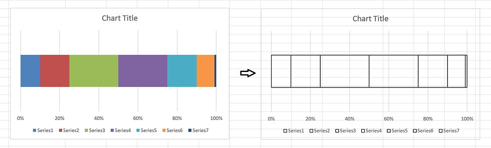
Now, you need to turn it into the chart on the right:
Right-click on the coloured section
Change the 'Outline' to black
Change the 'Fill' to 'No Fill'
Repeat for all coloured sections left
Right-click the chart area (white background)
Change the 'Fill' to 'No Fill'
If you've done this correctly, you should end up with the chart on the right and no background.
Now drag and drop you six-stage plot structure chart onto your own story chart. Resize the chart so that the 0% starts exactly where your chart starts, and the 100% lines up with the end. You can delete the legend key on the bottom, remove the outlines for the vertical grid lines, and insert text boxes on top to add the percentage breakdown to the chart. And now, you might have something like this:

If you prefer pie charts instead of bar charts, you can use the same techniques to create something that looks like this:

Assess your plot structure
Now you have your story in its graphical glory. Trust me, it's nice to see your story laid out this way! Now, using all the information from the six-stage structure, you can even go a step further and put this information next to your story table like this:

With this, I can see that the end of chapter 3 falls exactly at the 10%. I have taken 3 chapters to setup the story. Chapter 10 starts near 25%, where a main character becomes stranded somewhere unfamiliar. The midpoint is after chapter 22, where two major characters meet and their plotlines intertwine. Chapters 23 and onwards progressively raise the stakes as the protagonists infiltrate a city.
The major setback is at the end of chapter 31, where a major character is severely wounded.
The climax, which happens at around 95% near the end of chapter 26, falls with the 90 - 99% range.
Check your timeline
If your story has several characters and locations, it can be useful to incorporate this into your story structure. In another of my novels, I have five POV characters with the story taking place across different cities.
I wanted each of the five POV characters to have four chapters each, making twenty chapters in total. I also wanted the story to take place over a week. Once again, I used colour-coding to make this information easier to scan.


Since I wanted a linear timeline, I needed to ensure a consistent chronology as I switched between POV characters who were in different locations and time zones.
Making notes about time-zones helped me stay consistent, since morning in one city could very well be evening in another.
I also created a column chart to graph the wordcount per chapter throughout the novel. With this, I can see the average wordcount is roughly 5,000.

To compare the chapters between the five POV characters even better, I created another chart with each of their chapters grouped together. With four chapters each, I was able
to see how their individual chapter lengths progressed throughout the novel.
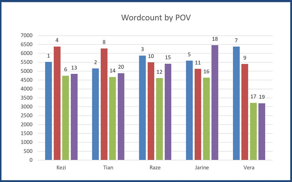
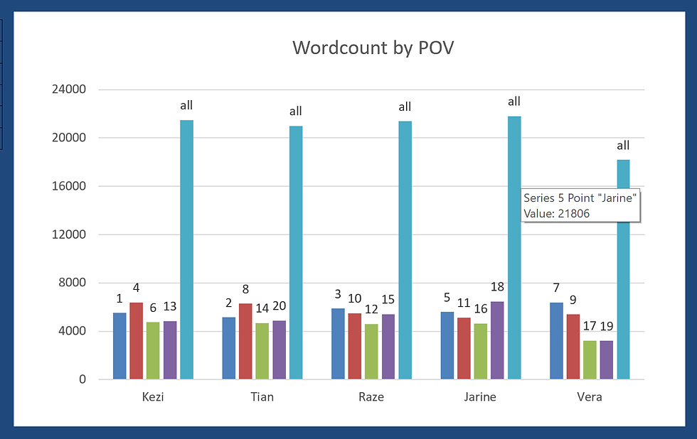
You can even add the total wordcount tally for each character to see how you've distributed pages between them.
Here, I can see that one character has a considerably smaller total than the other four, and I can decide if I've developed this character enough compared to the others.
There's one more tip I'd like to share about using Excel to analyse your story -- cast overview. If you have a sprawling ensemble cast in your story, like I did for this novel, noting them all down can really help! In this table, I added each character that appeared in each chapter.
Here, I added the characters in order of appearance with names highlighted in white to indicate a character's first appearance in the story, and all other subsequent appearances highlighted in blue. This can help you ensure you're not adding too many new characters in the second half of the novel (making it harder for your reader to get attached to them). Here, I could see that introduced a lot of new characters in chapter two - perhaps a few too many at once.

If you want to get a better overview of your story structure, I highly recommend using Excel. It's simple, flexible and reliable -- a great addition to your writer's toolkit!

Comments